Ranking the best license plates by state is a challenging task. Why? Some states have a wide range of number plates or have changed plate design multiple times.
Every state in the U.S. boasts a license plate that the locals find attractive. Just try to look at the plates on cars from different states, you’ll find almost all the plates attractive. However, some are more attractive than others.
So, here, we will discuss the best license plates for each state. Read on to find out the position your state’s license place is.
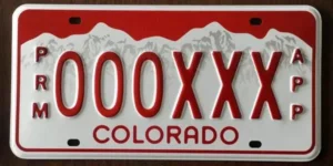
1: Colorado – The Winner!
There is a reason Colorado, aka “The Centennial State,” is also called the “Colorful Colorado.”
Its magnificent scenery, comprising mountains, rivers, and plains, makes it more inviting.
Colorado has a lot of mountains, and the state is proud to let the world know. The license plates even carry the design of a mountain, making it appear more unique, cute, and different from others.
The numbers on the license plates are also stamped, and there are only six numbers on it. In addition, the plate doesn’t look busy and cluttered like many others.
2. Nebraska:

Nebraska claims second place for best license plates by state. The state’s license plate is so cute that no one would argue if it takes the number one spot on this list.
The mural in the background sets Nebraska’s license plate apart. You can find the design in the state capitol building at Lincoln. This license plate is an artistic masterpiece. It would come out tops for the most creative license plate by state.
3: New Mexico:
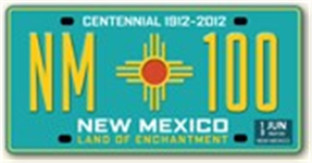
The New Mexico license plate is the third best on this list. But don’t let the position fool you. The state has one of the country’s most colorful and neatly designed license plates.
New Mexico is representing its name, the “Land of Enhancement.” The license plate’s letterings are so neatly sized and well-placed. They aren’t interfering with the “New Mexico USA” crafted on the plate.
4: Nevada:
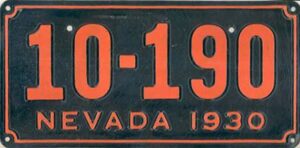
Have you tried comparing the Nevada license plate to others? If yes, what do you like about it? Well, here is what we found out.
Nevada boasts a modern license plate that is colorful yet isn’t cartoonish, or busy like many plates out there. In addition, the color doesn’t clash with cars. The powder blue color reminded us of baseball in the 90s and blends with anything it pairs with.
5: Vermont:
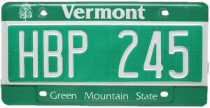
What makes Vermont’s license plate unique? Firstly, the name “Green Mountain State” written just below the stamped registry numbers is so cute. The fonts are also neat and captivating.
6: Delaware:
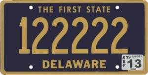
Delaware has a classic license plate, which the state has been using for many decades. Even when many states changed theirs, Delaware decided to stick with theirs.
Today, that decision is paying off. Though the state’s number plate appears cheap, the design and appeal make up for this lapses . The blue background and gold-painted numbers make it so attractive.
7: Hawaii:
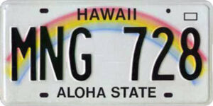
How many states will design a rainbow on a license plate and leave it that way for over three decades? If there is any, it has to be Ohio.
The rainbow design looks cute on the license plate. Another thing that makes Hawaii’s license plate unique is how it managed to keep it clean and legible despite the rainbow design in the background.
8: Utah:
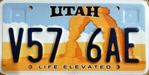
Utah’s license plate can stake its claim as one of the best artistic and illustrative license plates ever created.
The design is simple but elegantly illustrated to showcase its beauty, leaving room to highlight the rich natural resources the state has in abundance.
In most plate ratings, we won’t be surprised to find Utah’s license plate among the best 5 in the country. It’s such an incredible piece of art.
9: Missouri:
No offense to states blessed with tourist attractions, but it’s obvious many states consciously advertise how much of a tourist destination they are on their number plates.
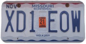
So, finding a state that isn’t doing such is rare. But the good thing is Missouri isn’t doing such on its license plate. The plate has the design of the seal of Missouri.
In addition, the write-up “United We Stand, Divided We Fall” reminds Americans of the Great Revolution. It was the unity that made the fight against the invaders successful. Missouri, on behalf of all Americans, thank you for the reminder that there’s strength in unity.
10: New York:

New York recently released their license plate, and it was worth the wait. The new plate is an upgrade on the previous one artistically, design, and appeal-wise.
The new N.Y. plate captures the state’s vast resources and attractions. It captures the Statue of Liberty, the Skyline of Manhattan, the coast of Long Island, the Forested mountain of Upstate New York, and Niagara Falls, yet looks neat and adorable.
The plate also captures the state’s map, slogan, “EXCELSIOR,” and seven digits. In addition, the numbers are stamped, not printed.
11: Washington:
Are you from Eastern Washington? If yes, chances are you don’t like the Washington license plate, and we know why. It’s probably because the iconic Rainier Mountain is the geographical feature on the plate.
The Washington license plate falls in the top 20 best license plates by state. But that doesn’t mean it doesn’t require an upgrade. It does.
The color used in creating the slogan, “Evergreen State,” is dull. It also doesn’t blend well with the other colors.
12: Maine:
Called “the Chickadee Plate,” Maine surprised us with their uniquely designed license plate. The diffused forest scape and atypical shade of green make the license plate look mesmerizing. The slogan “Vacationland” is just the perfect size. But again, it places Maine among states advertising how much of a tourist center they are.
13: Minnesota:
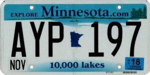
The centered state map, unique shade of blue, and 10,000 lake slogan make Minnesota’s license plate unique. The plate’s design has been there for many decades, and residents seem to have fallen in love with it.
The only concern most people may have is the license plate projecting Minnesota like a state on a rift. The state has over 10,000 lakes but has a land mass of 225,181 square km.
The blue color also gives some concern. It may clash with the color of some vehicles. But Minnesotans love it, and that’s what matters. Otherwise, they would have asked for a change of license plate design.
14: Montana:
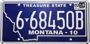
Montana is a state that understands that people have preferences when choosing license plates. According to the DMV, the state offers five license plates for the same fee.
So, you can choose your preferred license plate in Montana. It states that four of the five license plates are standard type, while one is modern.
Montana’s modern license plate looks classy. The fonts look clean, and on top of that, it has the state’s outline.
The only primary concern is that the license plate looks too cluttered. The designers tried to fit in too many numbers, but that didn’t work. Well, maybe a reduction in font size may help.
15: Alaska:
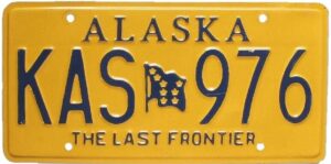
Alaska boasts a colorful and classy license plate that should earn it a top spot on this list. Unfortunately, that isn’t the case, and here’s why.
The license plate’s yellow color won’t fit most cars. For instance, it won’t fit red cars. So, imagine having a red Ferrari and a yellow license plate. It won’t complement your car in any way.
16: Arizona:
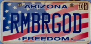
The Arizona plate is adorable. It represents everything the state is. The color, design, and artistry all combine well. The letters and numbers on the plate don’t appear cluttered like many others.
The Arizona plate looks classy, from the lumpy purple-colored silhouette desert to the rising sun. The state’s slogan, “The Grand Canyon State,” is tucked in an unused corner, making the plate well-organized.
17: Oklahoma:
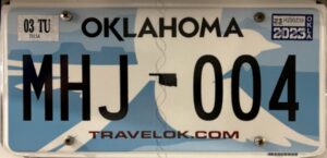
Have you checked the Oklahoma plate? It used to be one of our favorites until other states upped their license plate game.
The bird outline looks abstract and unique on this plate. Another thing that sets it apart is the color combination. The colors blend well, except for the red color beneath the figures.
18: Texas:
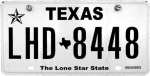
Even though the Texas plate is more like a paper template (it’s just plain), some things warranted us to place it at this position.
Firstly, the plate boasts all the elements that define a great license plate, such as consistency and history. it is uncluttered, and the state’s name, “Texas,” is boldly displayed at the top.
The Texas map is tucked in the middle, while the state’s slogan, “Lone Star State,” and a star design is something you can spot even from a distance.
19: Wyoming:
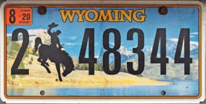
Wyoming has a unique and attractive license plate. It boasts a photograph showing Yellowstone National Park and, obviously, a cowboy.
You can deduce what to expect when you visit Wyoming by merely looking at the license plate. If this was another way to advertise a state, Wyoming deserves some accolades.
The only thing missing is the state’s slogan. But even if it was added, it would have made no difference. Most people may just be clamoring for the slogan because they’re familiar with seeing one on license plates.
20: U.S. Virgin Islands:
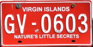
The Virgin Islands does not feature a modern plate design. Instead, it looks like a design from before digital printing became advanced. However, there are several unique features the plate has.
Underneath the letter and figures on this plate is the write-up, “Transfer Centennial,” which is a reminder that the territory is over 100 years old.
The Virgin Islands clocked 100 years in 2017, and are proud to let the world know its age. The san serif letterings, layering up of the multiple background elements, including the high contrast colors (orange and blue), make this plate unique.
21: Iowa:
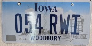
The Iowa license plate is another impressive plate, not because of its design but because the state deemed it fit to represent Des Moines, including its cities.
Des Moines is Iowa’s capital city, anyway. So, most people won’t see representing it on the state’s plate as a big deal, but maybe some of us do.
The evergreen grass underneath the numbers and letters is a reminder of the state’s passion for agriculture. Over 85% of the state’s land is farmed.
The only concern is the height of the grasses. They could have looked more presentable if they were shorter. Reducing the height of the grass will make the lettering free and more vibrant.
22: Pennsylvania:
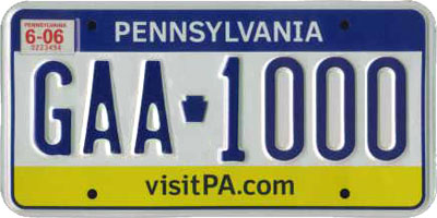
The first thing you’ll notice about this plate is the color. Yellow and blue colors! Please, spare us, Pennsylvania. Imagine having a red car with such a license plate. It will look so weird on the car.
We all know Pennsylvania’s slogan is the “Keystone State.” Unfortunately, we’re yet to understand what the item between the letter and the number on the plate is. Is it a wrapped gift box? Only the designer can tell.
Pennsylvania can do better. They should develop a more sleek plate design or return to the old ones.
23: Guam:
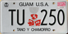
Guam boasts a simple yet attractive plate. The red flowers between the lettering make it prettier.
You’ll appreciate Guam’s license plate if you love plates with plain backgrounds. Again, it’s not flashy but looks professional. The plate will complement any car color too.
24: Tennessee:
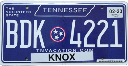
Tennessee “The Volunteer State.” You’ll find this tucked somewhere around the top left-hand corner of the state’s plate.
The plate features a blue background and letterings painted in white, with both colors complementing each other perfectly.
The state’s crest, “In God We Trust,” sits neatly between the letters and figures, adding some flare to the plate. Well done, Tennessee! Maybe, we’ll place you among the top ten license plates in the future.
25: South Dakota:
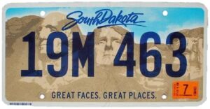
With the stylish display of Rushmore Mountain and the faces of top personalities, the South Dakota plate stands out from the rest.
The semi-transparent lettering and watercolor are another thing that makes this license plate unique. We appreciate the designer’s attempt to deviate from the usual black lettering we’re used to seeing on plates.
26: Maryland:
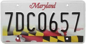
This plate catches the eyes for one reason: the Maryland flag. We understand that Marylanders like to paste their flag on almost everything, but is it necessary to have it on the license plate?
The flag boasts varied colors, so we’re glad the designers were smart enough not to include many write-ups on the plate. Otherwise, the plate would have looked too busy.
Besides, the flag also looked like it was covered with fog. It isn’t looking sharp; otherwise it would have been more appealing and earned a place at the top of this list.
27: Alabama:
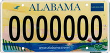
If you adore plates with illustrations, you might love the Alabama license plate. There’s a clear illustration of the city’s beach life on the plate, with the rising sun lighting the sky in yellow.
The plate is impressive, though it can use some improvement. The colors could be enhanced. They look quite dull. A brighter color would have made the illustration more captivating. But well done, Alabama! We understand what you were trying to do on this license plate.
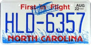
28: North Carolina:
North Carolina tried to escape the norm of the license realm. These guys tried to combine high-contrast colors (red and blue), which isn’t something many would have attempted.
Unfortunately, the combination didn’t work. We understand the space limitation and the need to write “North Carolina” on the plate. But must it be written in red?
29: Kansas:
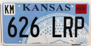
Alright, Kansas, we know what you guys were trying to do here: disrupt the plain background color with the crest. That was genius of you guys. Or, instead, it would have been a genius move.
The massive crest covers a sizable portion of the plain background but doesn’t display the main details like the mountain or sun.
Perhaps, a reduction of the crest’s size would have helped. Plus, if done, all the main elements that make the crest more captivating would have shown on the plate.
30: U.S. Federal Government:
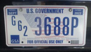
Even if the word “U.S. Government” isn’t written on the plate, anyone can understand who owns this plate.
In addition to being over two decades old and popular, this license plate boasts the United States flag in the background. A logo is also at the bottom left-hand corner, signifying the issuing agency.
This license plate doesn’t look flashy, but you can tell that it’s high-quality. It has the name of the federal government written all over it. You can feel it when you come across the plate.
31: Wisconsin:
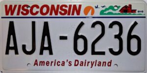
This state’s license plate would have made more sense if the strip of blue water in the top right-hand corner covered the entire plate. The lettering can retain its black color. On the other hand, the designers can try changing the color to white.
The plate looks neat, professional, and calm. The write-up “America’s DairyLand” and the farmhouse tucked away in the top right-hand corner tells you all you need to know about this state.
32: Mississippi:
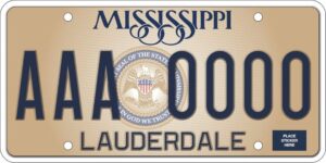
We like the Mississippi plate. From the letters “Mississippi” was crafted, to the state’s seal tucked in between the letterings, everything about this plate screams quality.
The plate looks cool. The lettering isn’t cluttered, and the plate doesn’t look busy. The background color looks cool too. However, making the letterings on the left and right semi-transparent would have elevated the plate’s appeal.
The crest in the middle would be visible. In other words, the complete write-up would have been visible.
33: West Virginia:
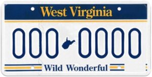
The colors used in this plate make it attractive. Otherwise, it would have even occupied the last position on this list.
We feel the yellow, blue, and white colors blended well, to some extent. It is obvious the designers know a thing or two about color combinations.
Another thing we appreciate is that the yellow color isn’t much on the plate. It even made the other colors pop.
34: Kentucky:
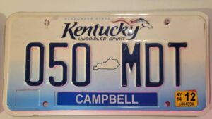
This state’s license plate’s position on this list doesn’t do it much justice. We think the plate looks quite captivating.
The write-up “UNBRIDLED SPIRIT” is a powerful motivation too.
35: Indiana:
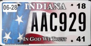
This plate would have been one of our favorites. Unfortunately, the designers complicated things by creating an illustration only they, or probably, only Indianans, can understand.
Anyway, the lush vegetation and blue sky gave us something to hold on to.
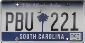
36: South Carolina:
There’s nothing artistic about this plate. But we like the simplicity. Another thing that strikes you when you view this plate is the write-up crested at the top.
It reads, ‘While I breathe, I hope!” Well done, South Carolina, for such an inspirational slogan!
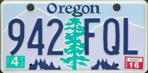
37: Oregon:
We understand the mountain and shrubs crested in this state’s plate. Besides, two-thirds of Oregon is almost like scrubland.
One thing that turns us off everything we look at this plate is the Christmas tree tucked in the middle of the lettering. We don’t know what the designer was trying to achieve, but the truth is, it didn’t work. Instead, it made the plate look awkward.
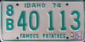
38: Idaho:
We like the illustration used in this plate. Unfortunately, the red sky and the write-up “Famous Potatoes” are the two things we have some issues with.
Firstly, was there an apocalypse when the plate was being designed? Well, there might be a better explanation for the red sky.
The second issue we have with this plate is the potato write-up. It’s unfair to mention potatoes and not include any on the license plate.
Conclusion
So, these are the best license plates by state. The first winner is Colorado, Nebraska, New Mexico, and Nevada.
A slight change in the design can improve most plates from the other states. So, it’s only a matter of time before most states make the necessary adjustment to improve their license plates’ appeal.


